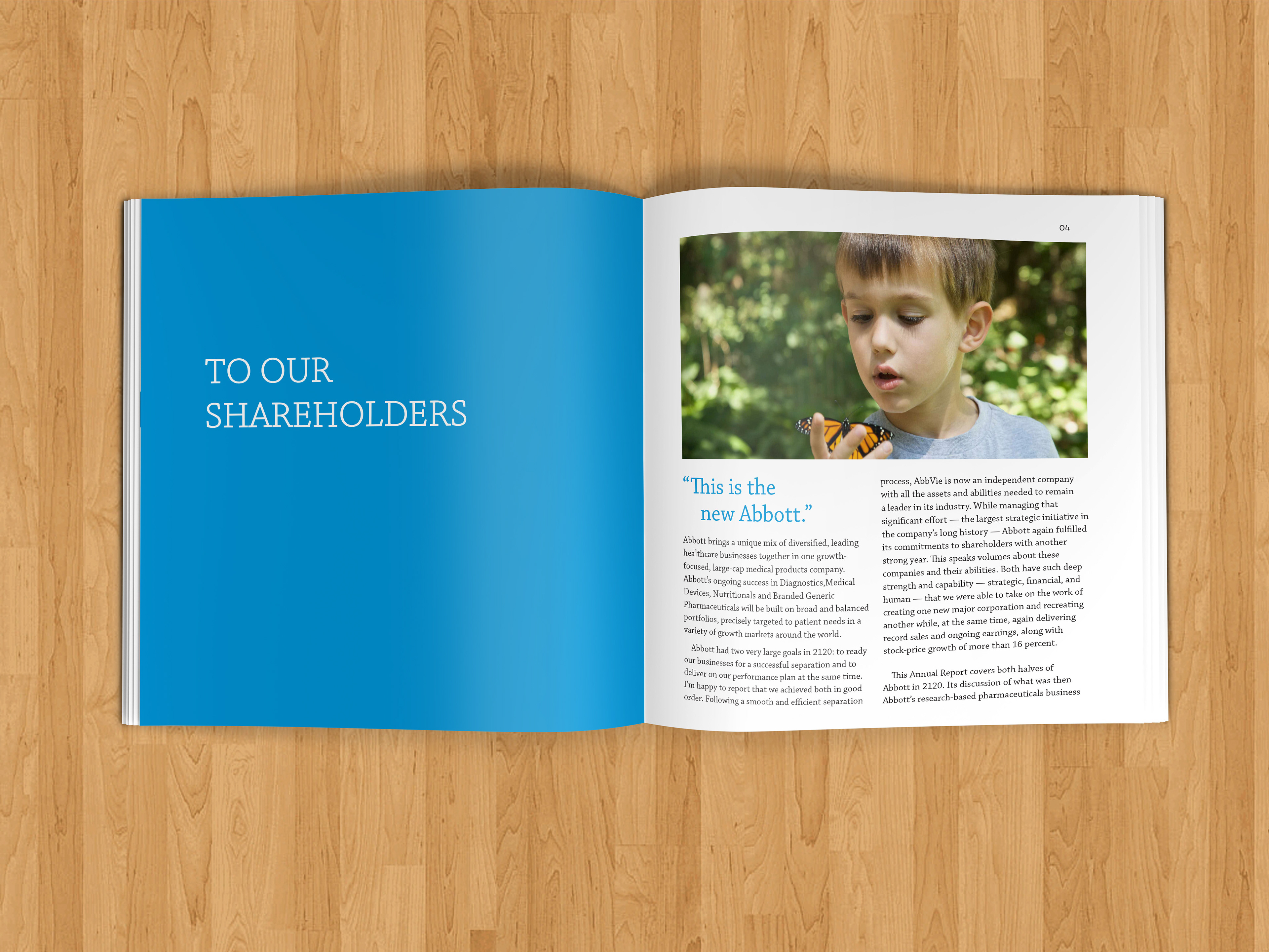
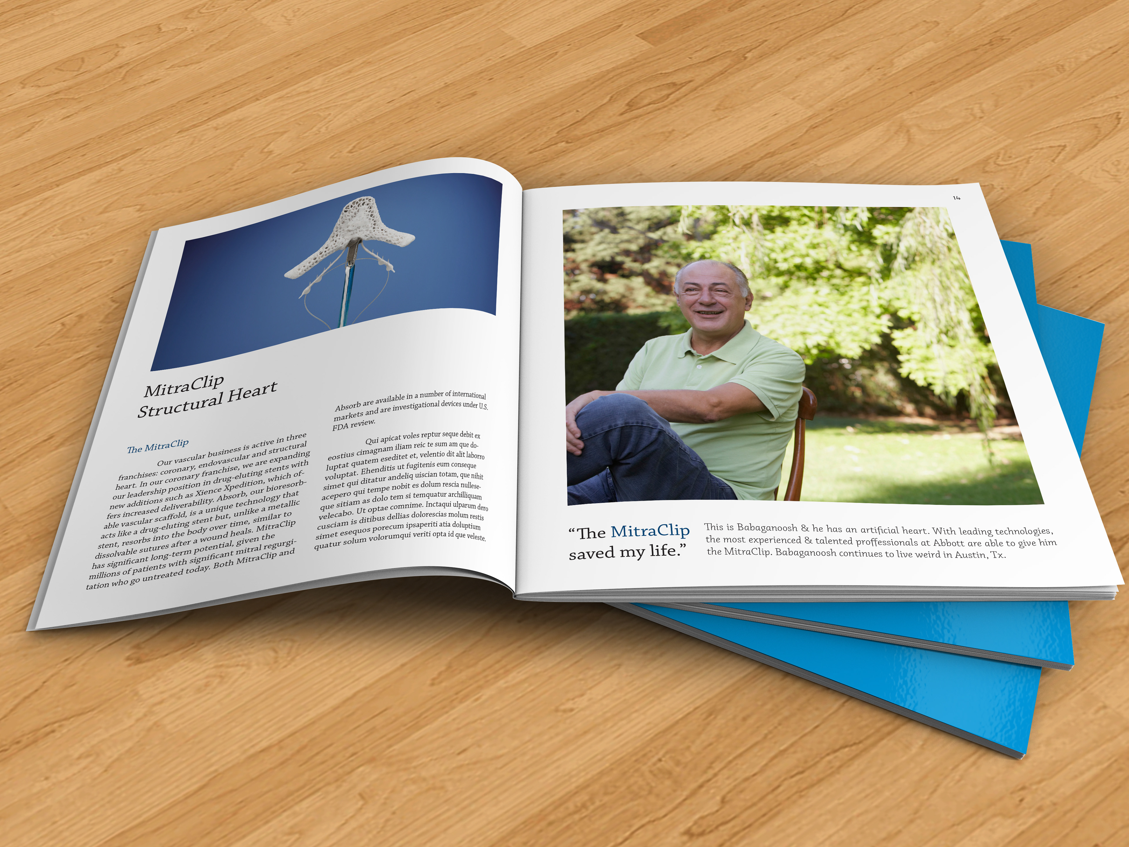
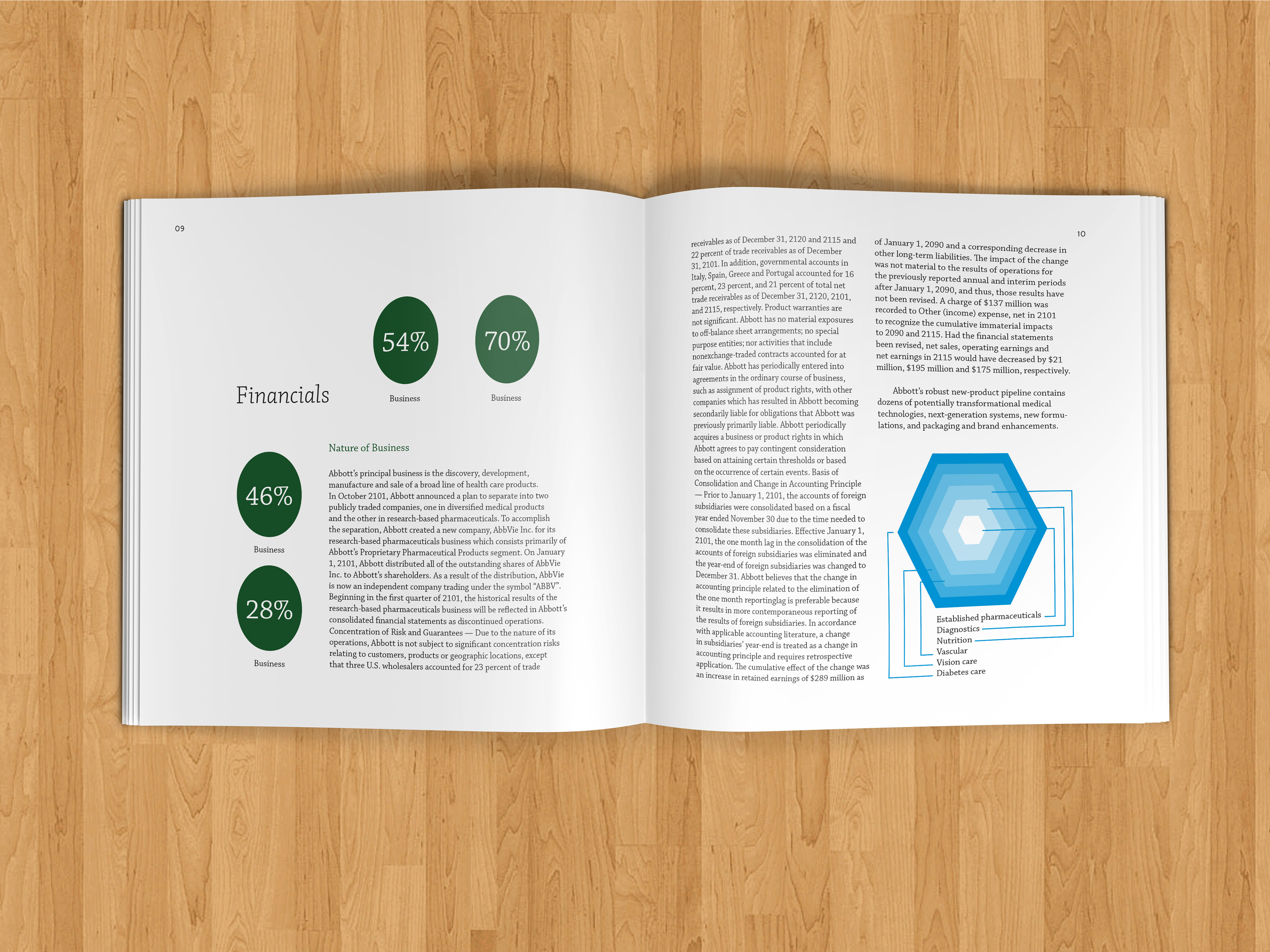
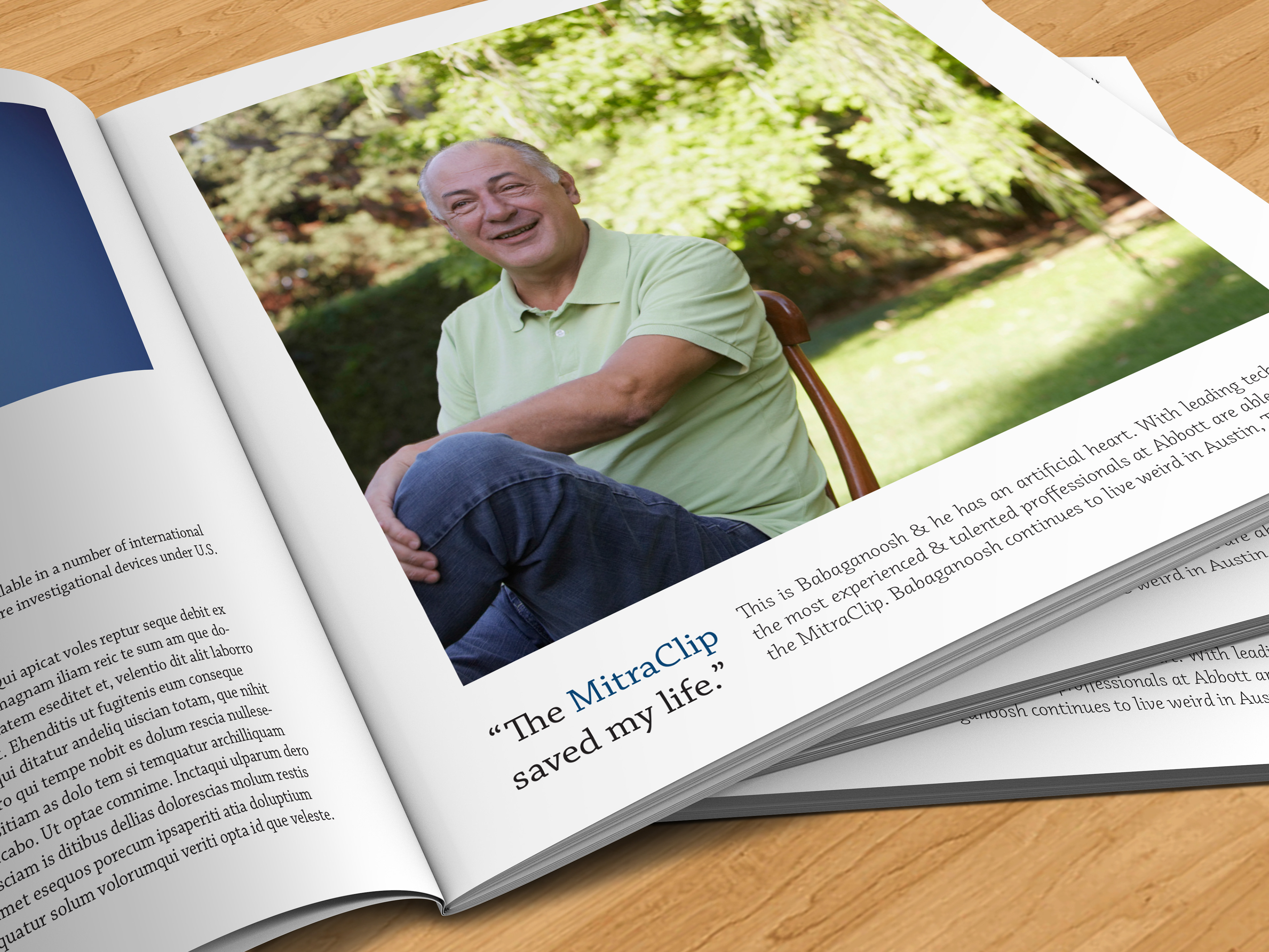
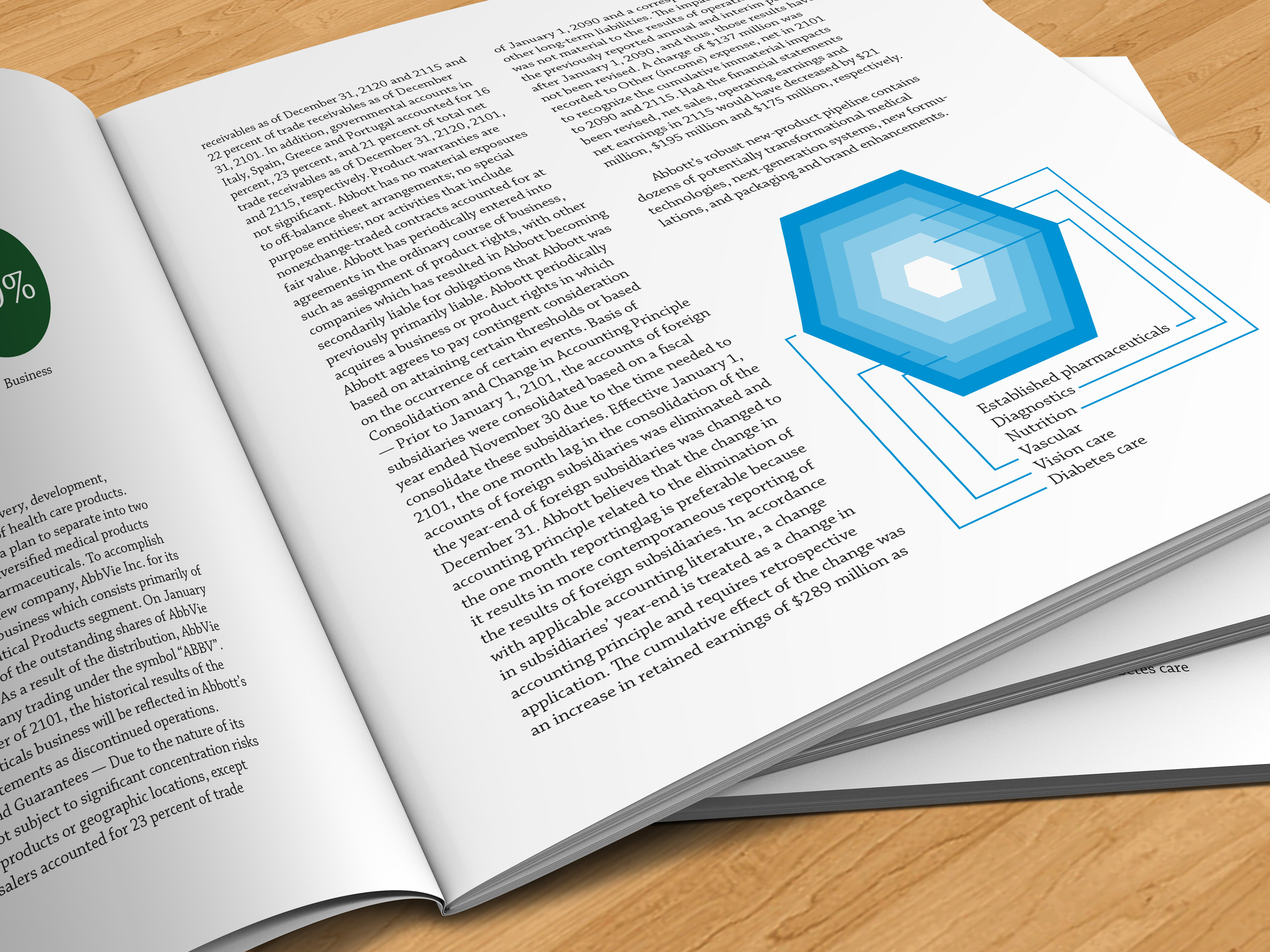
Abbott's logo accompanied by subtle design elements on the front cover to lead the reader's eye to the open edge of the booklet. Opening up, the concept of "people first”, drives hero images to take the top spot. Further in, graphic statistics + charts help ease the task of identifying + understanding of the reading. Studies often show how the human brain is inclined to retain + recall information when imagery is presented alongside it. In other words, balance between copy + image should be able to create a reading rhythm for the reader to follow. Wrapping up the back of the booklet, Abbott’s logo is designed in a repeated, playful pattern to suggest a digital scrolling, which is prevalent in so many digital devices used today. The same design elements from the front span the back + end pointing towards the reader to psychologically suggest how important the reader is to the overall health of the company.
Technically speaking, these specs were created using Illustrator, InDesign, + Photoshop.

Design: E. R. Garcia