Image is everything. How something looks, in this case, a business entity, will instantaneously earn the trust of their audience or be lost from all memory. Businesses become so closely associated with their logo, that when a person hears, "Google", they picture Google's colorful wordmark. That image is that company + without that image they don't exist...
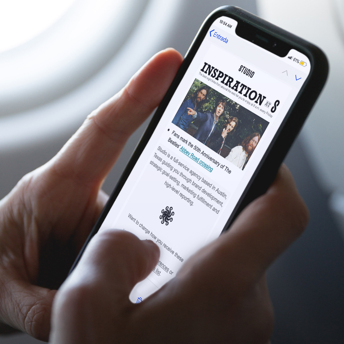
My role in helping to evolve the rebrand of the Statesman Studio was to develop a logo, complete with a wordmark + a bug. Keeping in mind their culture, their services, their location (Austin, Texas tech hub, baby!), + every individual working there possessing the collective conscious of working towards a greater purpose is what enabled these concepts to form. Note: the octopus was a mandatory component to keep in the new logo.
The final logo consists of the Studio wordmark created by Creative Director, A. Schaeffer + my pictoralmark (the bug) made the team. Logo was created with Illustrator.

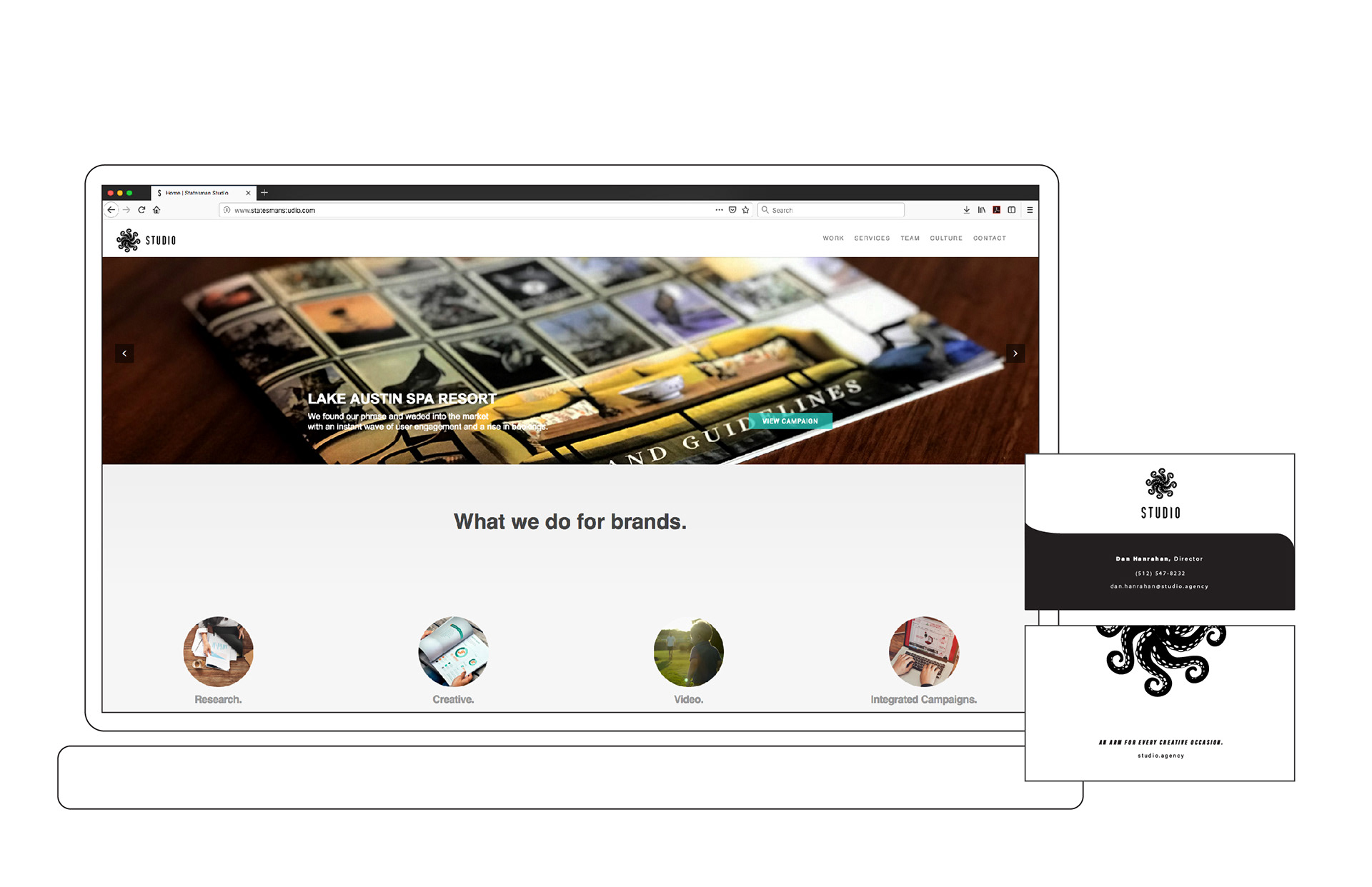
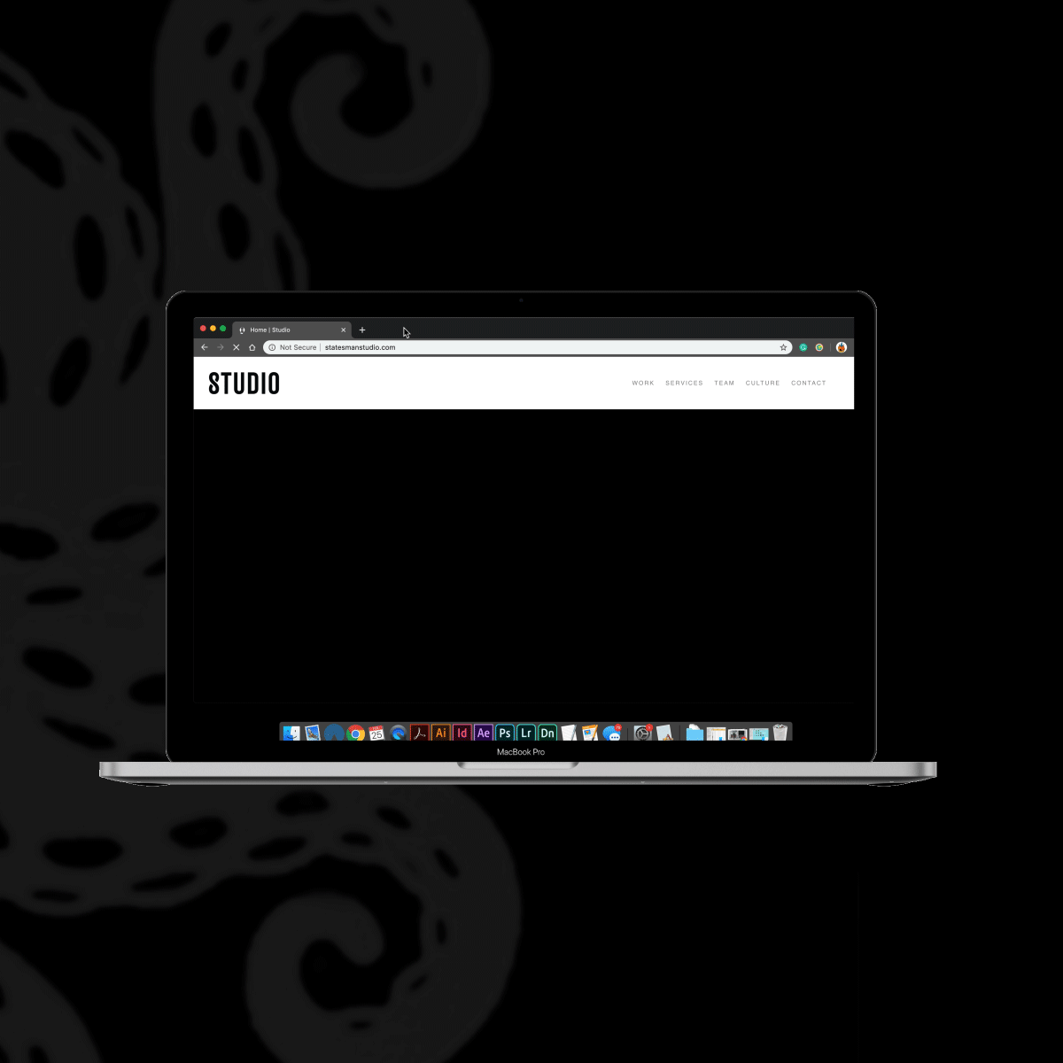

Client: (Statesman) Studio // Creative Director: A. Schaeffer // Sr. Design: K. Harrington // Design: A. Schaeffer + E. R. Garcia // Studio Director: D. Hanrahan